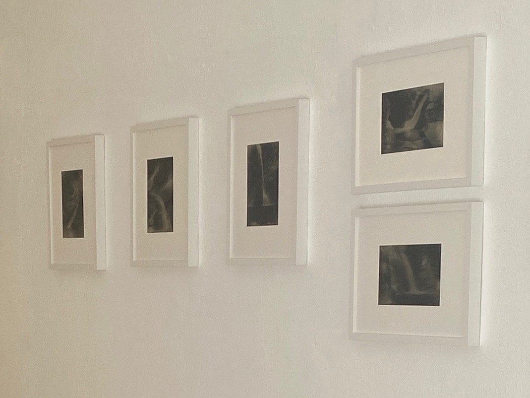
A selection of sixteen hand-tinted and waxed photographs by Italian artists based in Biella (Northern Italy)

Echi #8 hand-tinted and waxed pigment print, 9.6 x 6.7 inches, edition of 10, 2006
Opening Reception: Saturday, December 3rd from 12 to 4 pm
FRANCESCO TORI AND LINDA ZAMBOLIN: ECHI
(Archetipo Creativo)
Curated by VC Projects
December 3, 2022 – January 20, 2023
El NIDO art space, 1028 N. Western Avenue, Los Angeles, CA 90029
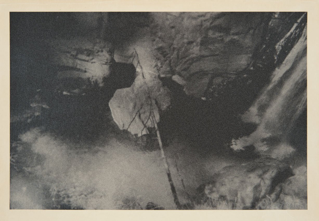
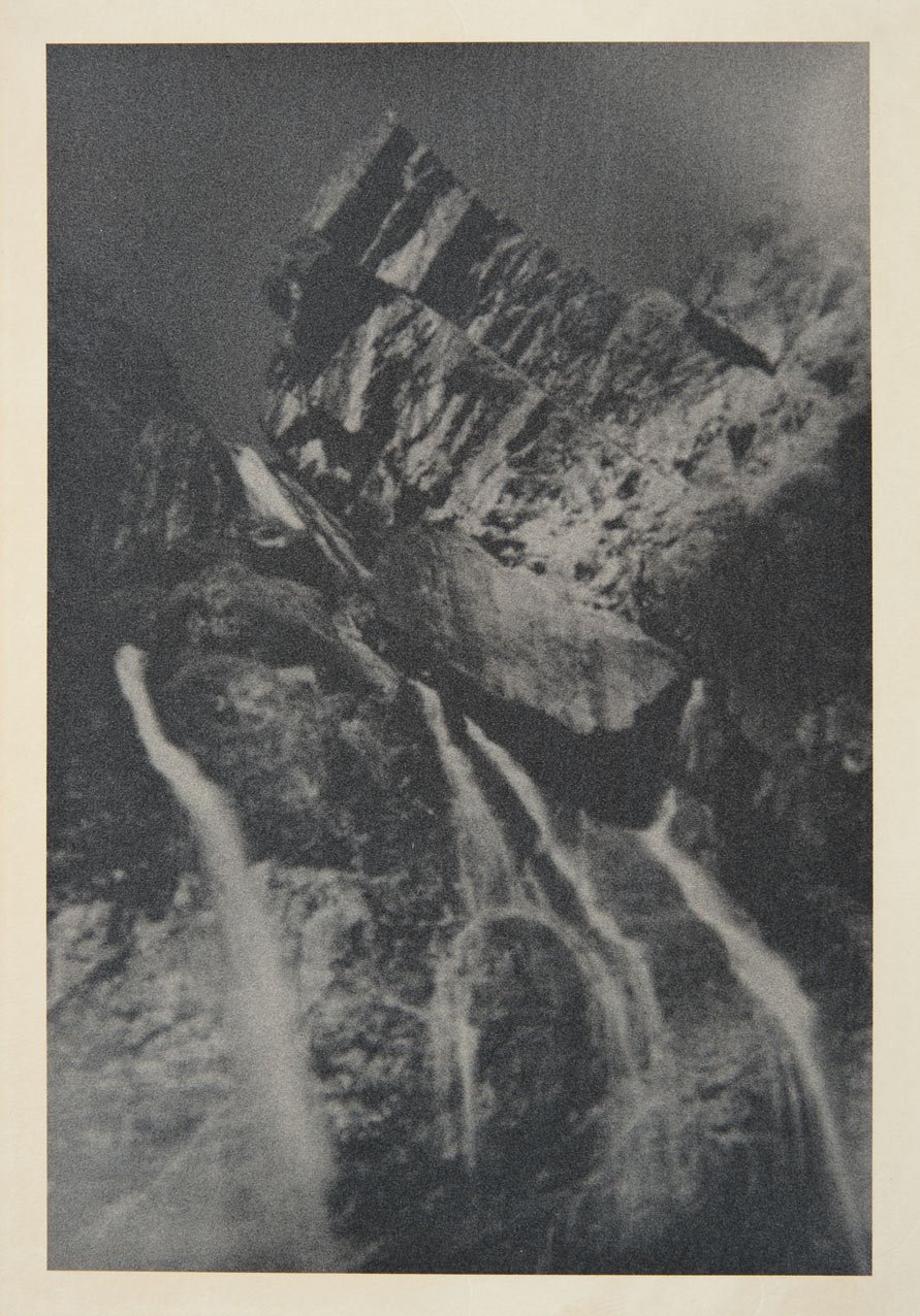
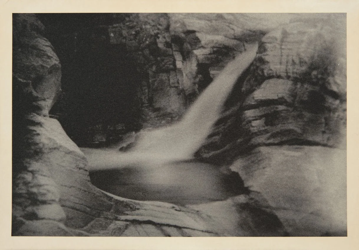
ECHI (Echoes) is a photographic project depicting the ascent to the top along a waterfall. The path, divided into different sections, embodies ascensional tension as well as progressive emotional relaxation, providing the right balance between the inner and outer world.
The observers face the grandeur of the mountain landscape where water is predominant. Through the strength and force of its primigenial nature, this element invites them to reflect on their own role in the universal plan and to reconsider their priorities.
The Victorian aesthetics of the images push the viewers to observe the subject not from a purely representative perspective, but from a sensorial and synesthetic point of view, leading them to tune to the frequency of a waterfall and to that roar of water that pierces right through the heart. A natural sound deeply rooted in us since the dawn of time, which eliminates the background noise of our thoughts when listened to over and over again and, like an echo, resounds and instills balance and peace.
These images were captured at Aosta Valley and the waterfalls are those of Lillaz within the Gran Paradiso National Park, Italy.
- Francesco Tori and Linda Zambolin

Echi #1 hand-tinted and waxed pigment print, 9.6 x 6.7 inches, edition of 10, 2006

Echi #4 hand-tinted and waxed pigment print, 9.6 x 6.7 inches, edition of 10, 2006
I was introduced to Francesco Tori and Linda Zambolin while in Italy during Summer of 2022 by L. Mikelle Standbridge, Founder of Casa Regis: Center for Culture and Contemporary Art.
At first glance, I interpreted the waterfalls as Linda and Francesco – who share everything in life and work. I imagined them hiking through the National Park and being attracted to the scenery synonymous with their own relationship.
Interestingly, it was the most abstract works that I first felt the deepest connection to. It was these grounding compositions amongst the numerous water falls that would make an intriguing exhibition for a Los Angeles audience. You see, after returning stateside, my memory of these became a ritual of cerebral significance. As each work gave me solace within the urban chaos I found at times impossible to bare. City-life can be jarring. Followed by, my memory of the waterfalls, which allowed me to surrender to the natural order of all things. I also refer to the entire group as an exercise in Merleau-Ponty’s theory of the living-body; perception becoming truth.
The photographs, which are hand-tinted and waxed, are influenced by 18th century romanticism. Francesco and Linda have revisited these techniques to not only differentiate their visual language in today’s world of photography, but also to return to a sense of refinement.
– Victoria Chapman, Curator

Echi #5 hand-tinted and waxed pigment print, 6.7 x 9.6 inches, edition of 10, 2006
Echi #6 hand-tinted and waxed pigment print, 6.7 x 9.6 inches, edition of 10, 2006
Archetipo Creativo was founded in 2010 by Francesco Tori and Linda Zambolin, two photographers with a common plan: pursuing their own formal and aesthetic research. In this quest the photographic tool brought back to its origins, is used to depict an artistic philosophy whose vocation is investigating and exploring the inner emotional dimension through the reflection of the external condition.
The different cycles composing Archetipo Creativo’s works, which take inspiration from the European Romantic tradition, invite the viewer to wander through natural environments where the realistic and descriptive character of places fades away to let the intrinsic emotional component come to light. Moving from one image - and one emotion - to the other, the observer takes an initiation trip, which inspires a reflection on the emotions that human beings have and have had in common over time. This ‘archetypal’ and primigenial aspect of the emotion as a universal and unchanging element can be achieved through the aesthetic/formal choice of pictorialism. Going back to the origins of photography, we can create poetic images of great immediacy and with a simple composition, able to capture the moment and fix it in the suspended time of dreams.
The aesthetic points of reference of Archetipo Creativo are the pioneering works of Fox Talbot, a researcher, and visionary dreamer, one of the first photographers in the 1840s to expose the paper treated with silver nitrate and gallic acid to obtain the first images called ‘calotypes’ (from the Greek word kalòs, meaning beautiful). Together with Talbot, there are the fantastic universes of Michele Kier, Gustave Le Gray, Margaret Cameron, and - later in time - Cesare Schiapparelli, linked to the territory of Biella.
To create the same evocative power of the calotypes, Archetipo Creativo launched a process that is similar but at the same time opposed to one of the first pioneers, as it destructures years of technical improvements in terms of sharpness, variable contrast, lens distortion correction metadata, and color intensity, i.e. all the elements that bring pictures nearer and nearer to what the human eye can see.
The marked pictorial dimension of the pictures is obtained through an original process mixing technology and manual skills. The image acquired in a digital format undergoes manipulation to check blurring, tonal range, shading, and burning. The photo is then printed on Fine Art paper, toned with a natural pigment to get the warm tone of calotypes, and hot waxed for a better tactile effect, granting the uniqueness of each copy.
The strong poetic component of these works - real poems arising from images - is enhanced by the choice of a small format, typical of the period between the mid-1800s and the beginning of the 20th century, which pushes the observer to move close to the work of art to establish an intimate dialogue with the emotional truth it expresses.
- Dr. Sarah Sivieri, Ph.D.

Echi #11 hand-tinted and waxed pigment print, 9.6 x 6.7 inches, edition of 10, 2006

Echi #13 hand-tinted and waxed pigment print, 6.7 x 9.6 inches, edition of 10, 2006

Echi #14 hand-tinted and waxed pigment print, 6.7 x 9.6 inches, edition of 10, 2006
Echi #2 hand-tinted and waxed pigment print, 9.6 x 6.7 inches, edition of 10, 2006

Echi #7 hand-tinted and waxed pigment print, 6.7 x 9.6 inches, edition of 10, 2006
Echi #12 hand-tinted and waxed pigment print, 6.7 x 9.6 inches, edition of 10, 2006

Echi #10 hand-tinted and waxed pigment print, 9.6 x 6.7 inches, edition of 10, 2006

Echi #9 hand-tinted and waxed pigment print, 9.6 x 6.7 inches, edition of 10, 2006

Echi #15 hand-tinted and waxed pigment print, 9.6 x 6.7 inches, edition of 10, 2006

Echi #16 hand-tinted and waxed pigment print, 9.6 x 6.7 inches, edition of 10, 2006
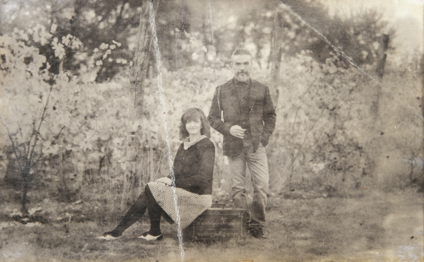
Francesco and Linda live in Biella, and they are partners in life and work.
They attended the John Kaverdash Academy of Photography in Milan for 4 years, specializing in Basic photography, Still-life, Fashion, and Digital retouching, and then they opened Archetipo Creativo, their own atelier.
Their knowledge of film photography, as well as their accurate shooting and post-production methodology, enabled them to work for several medium enterprises in different sectors all around Italy, but lately, their curiosity has pushed them to explore ‘fine art photography, taking pictures side by side in both natural and urban landscapes.
The curator living and working amongst ECHI series … going deeper
Q & A with Francesco Tori and Linda Zambolin

Introduction
First, I am in love with Northern Italy, and if I can’t live there, I can be reminded by the art, life, and landscape. This brings me to Francesco and Linda, whom I formally met in person this past summer during a visit to Northern Italy while visiting L. Mikelle Standbridge, Founder and Director of Casa Regis: Center for Culture and Contemporary Art, Italy, where from stateside, I am a liaison and curatorial advisor. A few months prior, their work was shared over email. During my visit, Mikelle made it possible for me to meet them in person and review three different portfolios. Almost immediately, I made my selection of the series that most resonated, and upon returning to Los Angeles, I reached out to propose an exhibition of ECHI series, which opened earlier this month.
This exchange has been so rewarding on many levels. To begin with, getting to know Francesco and Linda, their work, and understanding their inquiry, has brought me back to a grounded place. I am so grateful to awake each morning to the most calming and sensory-filled space - all based on living around their work. It is as if I were basking in the moonlight of the waterfalls each night and waking to a new order each morning. Also, there is a serenity, witnessing the works during various hours of the day, watching and reflecting on them as the light and weather change. Working amongst ECHI series, within the various compositions of water, rock, mountain, and sky, has been quite cerebral and intellectually charged.
Typical to my curatorial process, I am sharing an intimate Q & A of three questions per week that I have proposed to Francesco and Linda. It’s important to mention, Francesco and Linda answer my questions in Italian, and all our communications on both sides are met by using Google Translate. This has been a process and a great reminder of why it is important to engage with artists from afar, as there is so much to understand about human existence regardless of sharing a commonly spoken language. Not only the way one might see the world but how one might process it.
Please take a moment to read their answers, this is an exchange from Hollywood to Biella, (Northern Italy) not only in art but a great willingness to connect. Because it is the visual language that really counts, the hows and why’s are extra.
Victoria Chapman
Curator | Founder El NIDO


VC: Regarding the ECHI series, this is a remarkable place, filled with water and mountain scapes, what inspired you to go to this location?
Francesco and Linda via Google Translate: The interest in the environment. But not necessarily the landscape one. In fact, we believe that in ancient times many urban centers built by man represented a perfect meeting point with the natural landscape, arousing interest in the investigation.
In this case the choice was dictated by the curiosity to closely observe one of the most beautiful landscape attractions of the Aosta Valley, near Cogne in one of the most beautiful national parks in Italy.
The waterfalls that take their name from the hamlet of Lillaz, located in Cogne, are characterized by three waterfalls from the Urtier torrent with an overall height of 150 meters and according to some geologists the limit that separates the various types of rocks present corresponds to a "tectonic contact" or where in a few meters you pass from continental rocks to rocks formed on the ocean floor.
Our photographic approach was dictated by what we perceived from the environment. There was no particular project in our mind. But more than anything else there was the interest of representing through the image the emotional state that the natural landscape transmitted to us. In fact, as can be seen from the photos, the shots were sometimes taken with fast exposures, other times with longer ones. It was a path that led us from the bottom to the highest part of the waterfall where it begins and where a cross has been placed, symbol of man and his passage.
In the studio, by observing the photos, we were able to see how they seemed to no longer represent a mountain landscape but a similarity between human interiority at times confused and at times balanced and the path of the water, which is also daring among the rocks and quiet in certain situations; as contrasting forces that you observe outline the fragility of man. From this observation of the landscape arose the need to convey the concept of an inner journey starting from the confusion of everyday realities up to the highest achievement of balance by listening to the frequency of the water; hence the title Echoes.
Here, the water that beats on the rocks reflects a primordial sound that erases the background noise of thoughts and, like an echo, resonates, establishing balance and peace.


VC: The opening was delightful, and there was so much interest in the series. There was a real connection to romantic-era photography. Guests kept asking if the series was shot on film or digital? Can you please explain how you found the specific location per image and set up the shot and post-production?
Francesco and Linda via Google Translate: We are very pleased to have stimulated this demand from visitors.
The project was shot and developed digitally but with an analog approach. We recall that we had a film background having started our career in the early 2000s when film was still widely used.
Over time, due to our profession as commercial photographers, we have undertaken the use of digital, in many cases appreciating the speed and flexibility of the medium and above all the possibility of manipulation in post-production.
To date, this technology has come in handy for us to resume what was started since 1850 by the first photographers and the first printing processes. Artistically our point of arrival and research. So let's talk about calotype, images that are very far from modern stylistic lines.
The choice of this strongly romantic aesthetic is dictated by the fact that thanks to the use of particular tonal ranges, selective blurring and further manipulation performed by hand such as pigmentation and hot creature, the observer is led to internalize the image and therefore to perceive the message contained in it. Even the choice to print in that 15x22 cm format is not accidental. In fact, in addition to referring stylistically to the first prints of the mid-nineteenth century, we believe that the small size leads the observer to get closer, thus having a sort of visual and emotional empathy, creating a moment of sensory intimacy with what he is observing.
There are no particular settings but a lot of analysis of old vintage photographs seen in books and many attempts until we find our personal photographic style that expresses what we feel as we approach the landscape.

Part 2 of the Q & A
The Q & A continues with Biella-based Italian artists, Francesco Tori and Linda Zambolin regarding their ECHIseries currently on view at El NIDO. My time spent living and working around the exhibition continues to feed my curatorial practice and I have written to them with a few more questions. They have responded in Italian, and once again have used Google Translate to reveal their answers.
As a recap, last time, we learned about the artist’s choice of location, Francesco and Linda so eloquently said it was in: “The interest in the environment. But not necessarily the landscape.” We also discussed why they captured the series in digital over film. This week the focus is on process. I ask about their shutter speed, and their choice of material for hand-tinting. Why coffee over black tea? Lastly, we hear the answer about why they apply wax in the final stages of production.
It has been such a blessing to have this exhibition at El NIDO. I have loved sharing it with visitors. My respect for working with Francesco and Linda has only deepened. I love partnering with artists from afar and sharing their unique vision. As each has a fascinating story of the how’s and why’s of their studio practice. Learning about cultural differences, and why some choices are made are incredibly interesting. Each Q & A brings more value. I hope you enjoy this short read, and keep it in mind when viewing the work on screen or in person.
Sincerely,
Victoria Chapman
Curator | Founder El NIDO

Still our visitors to the exhibition are loving your work, and another common question is shutter speed. Can you give us at least one example of how fast or how slow you captured the work?
Francesco and Linda via Google Translate: The shutter speed was a choice to represent what the glimpses let us understand, becoming a means of conveying the message we interpreted while observing the waterfalls. The shutter times are approximately between 1/125, to freeze the bounces of the water in those photos where the intent was to convey restlessness, up to more than one minute in those where we wanted to convey peace and meditation. Our artistic goal in the projects we create is to reflect a deep emotion in the image, with the hope that the same emotion resonates in the observer.
An observation that we believe can concern all forms of art regarding your question Victoria: the technique is a means that allows you to know how to dose the tool, the difficulty lies in putting together the notions of an almost mathematical nature together with your own emotional perceptions to create that work, always speaking in an artistically generic way, which holds a fragment of the author's soul.


Let’s talk a little more about your process; why did you both feel toning the printed works in coffee was better than black tea? Or any other liquid?
Francesco and Linda via Google Translate: Ironically, "we like coffee," specifically the fair one!!
Technically we liked the yield of the toning that it returned by immersing the photographic paper giving it the typical gradation of the calotype.
The diluted coffee was the one that convinced us the most due to its warm tone, and diluted with various proportions of water; it produces a very pleasant and enveloping tonal response. Observing the freshly printed black and white print, it appears rather flat due to the tonal ranges deliberately sought after; in the development phase, immersion in the solution allows you to give the image, warming it, a more romantic and profound atmosphere.

A great mystery is your use of wax and painting it on with a fine brush during your post-production during the final stages of completing each work. What gave you the idea to experiment with wax? Some of our guests are wondering if the wax helps to seal the print to make it more archival.
Francesco and Linda via Google Translate: So surely the print treated with wax has a longer duration. In our research, we have discovered that the same technique was once used by many artists to increase the life of the frescoes. An example is Leonardo Da Vinci, but already in the times of the Greeks, the hot application of wax was used.
In our prints, however, the finish was designed to give a material perception of the surface as if to emulate the stratification of time that has passed. A very important element for us is that we try to make clear what we do. The materiality of the drafting also determines a deliberate veiling on the perception of the images, accentuating the emotional sensation of the shot.
Furthermore, the wax, for its natural tint, helps to give the final touch to the pigmentation tone we want and to rekindle the contrasts of the print.
